
Lowe: Why the LA Clippers decided it was time for a massive rebrand
Written by I Dig Sports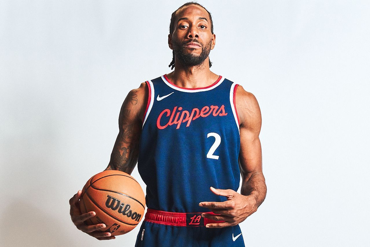
Only a few months after Steve Ballmer purchased the LA Clippers in 2014, he and his staff began reconsidering everything about the franchise: where it should play, what its logo should look like, what colors it should use, even the name "Clippers" itself.
They hired outside consultants to craft fan surveys asking about all the above. Meanwhile, the Clippers soared back into national relevance after the Chris Paul/Blake Griffin era gave way to the Kawhi Leonard/Paul George offseason of 2019. The Clippers haven't made the Finals, but they cracked the conference finals in 2021 for the first time in franchise history and have been consistent contenders when healthy.
Ballmer has proved willing to spend whatever it takes to win. In 2019, the Clippers announced plans to move into a new arena -- the Intuit Dome, which will open next season.
According to their internal studies, the Clippers have doubled their overall fan base in the past seven years, team officials said. They want to double it again going forward.
Feedback from fans was consistently against a potential name change, team officials said, describing the fan response to any suggestion of a name change as "outright hostility."
The feedback struck Ballmer. "The focus groups are advisory, not definitive," Ballmer told ESPN. "But I still listen to them, and I have heard, partially to my surprise, that there is no interest in a name change. I had thought about [the name] years ago, before I got the team, but we heard similar reactions back then."
But the team knew it needed a rebranding. Its current logo -- a basketball with a giant blue "C" containing the "LA" mark inside of it -- has been mostly panned as generic and bland.
Ballmer wanted a monogram-style mark that would play internationally, Gillian Zucker, president of business operations for the Clippers and Intuit Dome, told ESPN. Even amid the overall criticism of the logo, the team learned that fans liked the idea of a semi-stacked "LA" mark -- with the "A" sitting atop and within the lower leg of the capital "L."
With fans expressing such affection for the name -- derived from clipper ships and naval vessels that dot the coast off of San Diego, the team's original California home -- team officials decided it was best to keep the name and tether any new art to it. They wanted a makeover that would stay true to the Clippers' traditional name, colors and iconography.
Focus groups and respondents to those fan surveys repeatedly expressed optimism that the franchise was in good hands under Ballmer, officials said.
"People said this a hundred times: 'This team has direction now,'" Zucker said. "They said it over and over."
The concept of direction -- of forward momentum -- struck a chord. The result is a sharp new primary icon mixing the motifs of a compass and a naval ship:
Here is the global logo -- which by league rule contains the full name of the team:
The color scheme is mostly classic Clippers, though with a new emphasis on navy blue. The ship is the centerpiece. There might be some snark about its semblance to a swimming shark, but the team is probably OK with that. The Clippers wanted the ship to look menacing -- as if it were coming straight at you, officials said.
The ship also helped the team preempt any potential copyright claims from Major League Baseball's Seattle Mariners, who have used compass imagery on their art, per league sources.
The outer edges of the ship's sails curve, mimicking actual sails in the wind. The font is inspired by the typeface often used on the hulls of gray naval vessels, the team said.
The two colored rings on the global logo -- red on the outside, powder blue on the inside -- offer nice touches of color. They were the brainchild of Christopher Arena, the NBA's head of on-court and brand partnerships, who felt the art needed some brighter pops, officials said.
That logo will shine at center stage on the Clippers' new court at Intuit Dome:
In a fun touch, the "N" in "Angeles" on the outside of that center-court logo actually points due north, team officials said. The red half-circle above the foul line is a welcome dose of color. The longitude and latitude of the city of Inglewood -- home of the Intuit Dome -- are on the sideline of the court. The overall look is minimalist and sleek. (This will not be the Clippers' only court next season, sources said.)
The primary icon is on the shorts of the team's new association and icon jerseys -- rendered in white and navy, respectively:
The jerseys are simple and clean. The team kept the general upward, scripted "Clippers" wordmark but sharpened the font; it was thicker and curvier -- most visible in the cursive lowercase "l" -- in some of the team's older jerseys, with some outlining around the letters:
"It was a little cartoony," Zucker said of the old font. "We wanted it to feel more serious."
The team's third jersey set -- the statement edition -- is red and a little different:
The team went with "Los Angeles" instead of "Clippers" on the front and the shortened "Clips" -- a favorite of Ballmer's -- on the waistband.
The Clippers have used black jerseys before but opted to scrap that look for now. "We kept hearing from people that black was overdone," Zucker said.
Under George's right arm, you can see three nautical flags stacked atop each other -- the nautical symbols for "LAC," another nod to the naval origin of the team's name. The same three flags are rendered against a white background on the left side:
None of the three jerseys revealed today is powder blue. In those surveys and focus groups, fans often mentioned their love for that shade, Zucker said. The Clippers know that. Expect some powder blue in the future.
Also expect more of "Clips" across LA's art -- including as part of its secondary logo collection:
The team is particularly excited about that scripted "LA", with the "A" sitting perched atop the horizontal part of the "L." They are hoping that structure -- the "A" atop and within the "L" -- is distinct enough from the Los Angeles Dodgers' uber-famous "LA" logo, which has the two letters intersecting.
"It will make for a phenomenal hat," Zucker said. "In 20 years, people will look back and this will be iconic for the Clippers." That logo is on the waistband of the team's association and icon jerseys.
The real masterstroke might end up being the stylized "C" partial logo, which meshes two nautical images: a compass that also resembles a loop hook around which a sailor might knot a rope. That logo could eventually appear on jerseys, including on the waistband, Zucker said.
All of this coincides with the move next season to the Intuit Dome, which will include state-of-the-art technology and a series of features designed to get fans to focus on the game itself. That includes The Wall, a giant 51-row section reserved for fans who prove (through various check-offs) their bona fides as Clippers supporters. The concourse will be dotted with countdown clocks that will tick during commercial breaks to alert fans to return to their seats for the resumption of game action, Ballmer said. In suites, the food will be set up closer to the court instead of toward the back of the suites.
The game is the thing, and it will look different with the Clippers' massive rebrand.
"The hope [for the look]," Zucker said, "is that it's modern but feels like it has been around forever."


 facing lengthy recovery")


 Phone: (800) 737. 6040
 Fax: (800) 825 5558
 Website:
  Email:


